
Back in January 2014 I wrote an article on how brand colour had just got harder. Wind the clock on six years and I thought it was time to revisit as it’s now off the scale. Over the coming months, I am going to write a few blogs on this subject as it is a complex and interesting topic and I am asked about it all the time.
It’s really important as a brand specialist and as a business owner to understand colour when looking at both your logo and the positioning of your brand.
Whether you’re choosing colours for your brand, logo, website or uniform you must understand how those colours are perceived by your customers. You want them to make that emotional connection with you so that they go ahead and make that initial purchase and become forever customers. So here’s a little introduction as to how we perceive each of the colours.
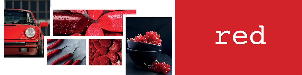
RED is the colour of love and roses
It stands for power, strength, excitement, romance and passion.
Red is also associated with anger, danger, pain and aggression. Red can also make you feel hungry hence, MacDonald’s, Pizza Hut, KFC etc. It has also been proven to speed up your reactions, hence why sale signs are always in red as well as stop signs and your overdraft balance.
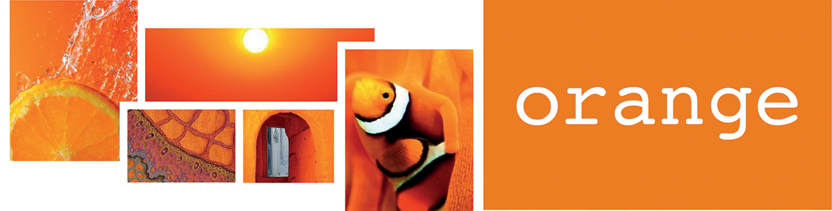
ORANGE is the colour of beautiful sunsets
When you think of orange you probably think of warm fires and carrots. It also signifies confidence, energy, warmth, fun, excitement and good health. The colour is associated with value and many supermarket home brands confirm this, again orange can stimulate your appetite so many restaurants use orange within their colour scheme.
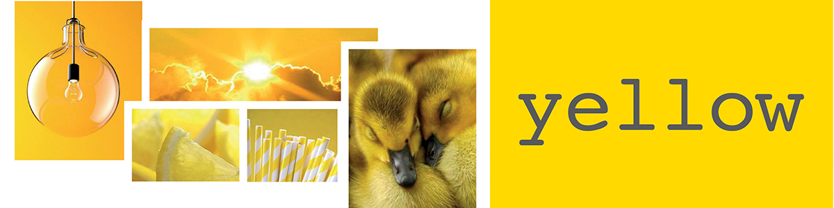
YELLOW is the brightest colour to the human eye
It is the most visible colour on the colour spectrum. It is a cheerful color that exudes excitement and happiness. It is the colour of sunshine, youth and fun.
When used with white, yellow tends to disappear. So, when you want to highlight it, make sure that you combine the yellow with darker colours like black
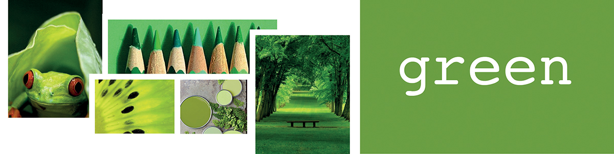
GREEN represents the natural world, ecology and tranquility
Green is the colour of calm, rest, the environment and sustainability. People waiting to go on to the stage or television wait in the green room to relax. It is a sign of health and sickness hence pharmaceutical companies use it and hospital walls are usually painted green.

BLUE is perceived as trustworthy, attractive and calm
Often used by the financial sector as it’s deemed to be the colour of stability and reliability. It is also the world’s most favourite colour and is deemed friendly and inviting, which is why it’s used by Facebook and Twitter. On a negative side the colour can reflect sadness and cold as well as unappetizing.
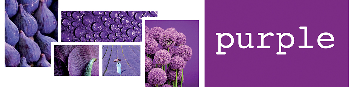
PURPLE is imagination, wealth and luxury
Seen as the colour associated with the royal family, as it implies wealth, luxury and sophistication. It is also linked with time, space, spirituality and meditation.

GREY is neutral, timeless and intelligent
It has no dominant psychological characteristic however is deemed modern and sophisticated which has worked for the IT industry and many luxury brands.
Your brand identity is how the world perceives your brand of which colour is an integral part of. Choosing the right colours for your brands personality is crucial and you should take your time in making this decision, look at your competitors as well as other brands that you like the look and feel. It is only then that you can make the right decision. If you need help then Thriving Brand are here, just give us a call or email.